- Home |
- About |
- Contact Us |
- Privacy |
- Newsletter |
- Shop |
- Donate
What is a Line Graph?
Support Page

What is a line graph?
Are line plots the same thing as a line graph?
What is the difference between a line graph and a bar graph?
Have a go at some of our line graph worksheets.
Find out more below.
What is a Line Graph?
A line graph is a graph that has a line joining up individual data points which have been plotted on the graph.
The graph has a scale - usually on the vertical axis, and it may also have a scale on the horizontal axis.
Line graphs are widely used in all kinds of data analysis.
They are a great way to visually look at trends and changes over time.
What is the difference between a line graph and a bar graph?
A line graph is a graph that uses a line to connect the data points. Usually, the vertical axis in a line graph has a scale to show the value of the data points.
A bar graph is a graph which uses bars to show the value of different data points and similar to a line graph, usually has a scale on the vertical axis.
What is the difference between a line plot and a line graph?
A line plot uses dots or crosses to represent individual data points in discrete categories. Each dot or cross represents one data point, so a scale is not needed.
A line graph is a graph that uses a line to connect the data points. Usually, the vertical axis in a line graph has a scale to show the value of the data points.

When should I use a line graph to display data?
It is often quite hard to choose the correct graph to show your data in the most effective way.
Line graphs are often used to display continuous data where each point on the line has some meaning.
They are especially useful for showing trends over a period of time, or for showing how one things changes relative to another.
You would not usually use a line graph for showing discrete data showing different categories on the horizontal axis.
A good example of a line graph showing the distance travelled during a cycle ride

So why is this a GOOD example?
The data points show the distance Frazer traveled during a cycle ride with measurments taken at 15 minute intervals.
In this line graph the inbetween, or intermediate, points do have meaning.
If we look at any point on the line graph then that point shows roughly how far Frazer has traveled at a given amount of time.
The data works well as a line graph because it is continuous and the inbetween points show the time and approximate distance traveled.
A bad choice of a line graph showing different tree heights

So why is this a BAD example?
The data points show the average heights of different trees.
In a line graph the inbetween, or intermediate, points should ideally have some meaning or help to show a trend.
If we look at a point on the line halfway between any two trees, such as the Australian Mountain Ash and the Coast Douglas Fir, the point has no meaning at all and does not show any kind of trend.
There is no trend to see because the trees are all a completely different species.
The data this line graph is showing is NOT continuous and there is no reason to connect the different trees together with a line.
This data would be much better displayed as a bar graph like the one below.

Examples of Line Graphs
How to 'read' a line graph is a skill which you pick up the more you practice.
Here are a few different examples to help you understand what is a line graph and explanations of what the graph is telling us.
Example 1) Line Graph showing the distance traveled during a cycle ride
Let's have another look at this line graph and see what the line is telling us.
We can see that in the first hour (60 minutes) Frazer cycled 12 miles.
Frazer traveled a total distance of 20 miles in 120 minutes or two hours.
We can see that between 75 and 90 minutes Frazer did not travel any further, so he must have had a rest, or stopped to fix a flat tyre.
In the second hour, between 60 and 120 minutes, Frazer only managed to travel a further 8 miles.
If we were asked to estimate how far he had cycled in the first 20 minutes, we can use the line to say that he had traveled about 4 miles.
Example 2) Line Graph showing a survey of the number of Galapagos Penguins.

The line graph above, shows the number of Galapagos penguins seen during a penguin survey each year.
Looking at the line graph, we can see:
- The number of Galapagos penguins was at the lowest in 2011. Only 25 penguins were seen.
- The steepest decrease in population was between 2008 and 2009.
- Between 2009 and 2010, the number of Galapagos penguins seen remained unchanged.
- The steepest increase in population was between 2015 and 2016.
Example 3) Line Graph showing the average price of a gold ounce from 2013 to 2023.

The line above shows the average gold price per ounce from 2013 to 2023 rounded to the nearest $20.
Looking at the graph, we can see:
- The average price decreased between 2013 and 2015.
- After 2015, the average price has been in an upward trend and has increased most years.
- Between 2016 and 2018, and also between 2020 and 2022, the price stayed flat and did not change much.
- The sharpest increase was between 2019 and 2020.
Line Graph Worksheets
We have a range of line graph worksheets from 4th grade and upwards.
Our worksheets involve:
- creating line graphs;
- interpreting line graphs.
Line Plot Worksheets by Grade


More Recommended Math Worksheets
Take a look at some more of our worksheets similar to these.
What is a Box Plot?
If you are looking for some more help and support with box plots, then try the link below.
The box plot support page below will help you to learn all about box plots and how they work.


Lower Quartile and Upper Quartile Support
If you want some more help identifying the lower and upper quartiles, then take a look at this page.

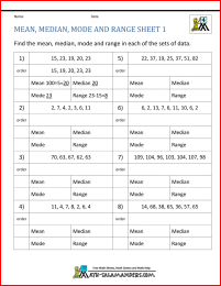
Mean Median Mode and Range Worksheets
The sheets in this section will help you to find the mean, median, mode and range of a set of numbers, including negative numbers and decimals.
There are easier sheets involving fewer data points, and harder ones with more data points.
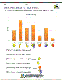
Bar Graph Worksheets
The sheets in this section will help you to solve problems involving bar graphs and picture graphs.
There are a range of sheet involving reading and interpreting graphs as well as drawing your own graphs.
How to Print or Save these sheets 🖶
Need help with printing or saving?
Follow these 3 steps to get your worksheets printed perfectly!
How to Print or Save these sheets 🖶
Need help with printing or saving?
Follow these 3 steps to get your worksheets printed perfectly!
Subscribe to Math Salamanders News
Sign up for our newsletter to get free math support delivered to your inbox each month. Plus, get a seasonal math grab pack included for free!
Math-Salamanders.com
![]()
The Math Salamanders hope you enjoy using these free printable Math worksheets and all our other Math games and resources.
If you have any questions or need any information about our site, please get in touch with us using the 'Contact Us' tab at the top and bottom of every page.