- Home |
- About |
- Contact Us |
- Privacy |
- Newsletter |
- Shop |
- Donate
What is a Line Plot?
Support Page

What is a line plot?
Are line plots the same thing as a line graph?
What is the difference between a line plot and a dot plot?
Have a go at some of our line plot worksheets.
Find out more below.
What is a Line Plot?
A line plot is a visual way of recording data values.
Line plots are useful for displaying small amounts of data in discrete bins (categories).
You can use dots, or crosses or different symbols to represent the data points on a line plot.
One of the advantages of using a line plot, rather than a bar graph or line graph, is the speed and ease at which they can be created.
What is the difference between a line plot and a dot plot?
A line plot and a dot plot are the same thing - their names can be used interchangeably.
What is the difference between a line plot and a line graph?
A line graph is a graph that uses a line to connect the data points. Usually, the vertical axis in a line graph has a scale to show the value of the data points.
A line plot uses dots or crosses to represent individual data points in discrete categories. Each dot or cross represents one data point, so a scale is not needed.

Examples of Line Plots
Example Line Plot showing children's ages at a tennis club.

The line plot above, shows the ages of a group of children playing at a tennis club.
Using a line plot, we can clearly see:
- how the information in the frequency table has been changed into a more visually informative line plot.
- how the data is distributed in the line plot.
- In the tennis club, we can see that the majority of the children are aged 9 years or younger.
- which the most and least common ages are:
- In the example above, the most common age is 9 years; the least common age is 10 years.
- the number of children in the club by counting the check marks
- In the example above, we can see that there are a total of 18 children in the club.
Example Line Plot showing the number of goals scored by a soccer team.

The line plot above, shows the number of goals scored by a soccer team in the matches they played.
Using a line plot, we can also see:
- how the data is distributed along the line, whether it is randomly distributed, skewed, or symmetrically distributed.
- the mode is the easiest to spot - it is just the number on the horizontal line which has the most data points, or crosses.
- In the example above, we can see that the most frequent number of goals scored was 2, so the mode is 2 goals.
- the range of the data set by subtracting the minimum value from the maximum value;
- In the example above the range of goals scored is 6 − 0 = 6 goals.
- the median can be found by working out the number of data points and then finding the middle one;
- In the example above, there are 15 matches played in total. The middle match is the 8th. The number of goals scored in the 8th match was 3.
- the mean can be found by adding up all the values and dividing by the number of values.
- In the example above, the total goals scored is 0 + 1x2 + 2x4 + 3x3 + 4x1 + 5x2 + 6x2 = 45. The number of matches is 15. So the mean is 45 ÷ 15 = 3 goals per match.
Line Plots Worksheets
We have a range of line plot worksheets from 2nd grade and upwards.
We have two separate types of line plot worksheets:
- creating line plot worksheets;
- interpreting line plot worksheets.
Line Plot Worksheets by Grade


More Recommended Math Worksheets
Take a look at some more of our worksheets similar to these.
What is a Box Plot?
If you are looking for some more help and support with box plots, then try the link below.
The box plot support page below will help you to learn all about box plots and how they work.


Lower Quartile and Upper Quartile Support
If you want some more help identifying the lower and upper quartiles, then take a look at this page.

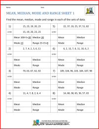
Mean Median Mode and Range Worksheets
The sheets in this section will help you to find the mean, median, mode and range of a set of numbers, including negative numbers and decimals.
There are easier sheets involving fewer data points, and harder ones with more data points.
What is a Line Graph?
If you are looking for some help and support to understand what a line graph is and how they work, then try the link below.
The line graph support page below will help you to learn all about line graphs and when they should and should not be used.

How to Print or Save these sheets 🖶
Need help with printing or saving?
Follow these 3 steps to get your worksheets printed perfectly!
How to Print or Save these sheets 🖶
Need help with printing or saving?
Follow these 3 steps to get your worksheets printed perfectly!
Subscribe to Math Salamanders News
Sign up for our newsletter to get free math support delivered to your inbox each month. Plus, get a seasonal math grab pack included for free!
Math-Salamanders.com
![]()
The Math Salamanders hope you enjoy using these free printable Math worksheets and all our other Math games and resources.
If you have any questions or need any information about our site, please get in touch with us using the 'Contact Us' tab at the top and bottom of every page.